Most people don’t give typography a second thought when they see it. That’s ok. Fonts are like audio in film — you don’t notice it until it’s off.
Font usage is vital to a brand image, and amateur designers tend to not know (or worse, not care) which fonts make people feel aesthetically pleased, and which fonts make people think, “I hate that, but I’m not sure why.”
Whether they’re dated, overused, or just plain ugly, these fonts need to be deleted from your life like the phone number of that ex you keep drunk texting.
Arial
This one may surprise people because it’s so common. That’s because it was designed in 1982.
Arial isn’t used much in logo design, but if you settle for it on your website or marketing materials, someone just got lazy. Opt for Open Sans or Lato instead.

Bleeding Cowboys
This font inspired this post. I loathe this font the way Luke Bryan loathes any song without the word “truck” in it. And I use that comparison with purpose.
My design career being set in Nashville, I’ve seen this god-forsaken font on so many amateur, homemade, small-budget album covers and show posters that I want to burn every pair of cowboy boots Fahrenheit 451 style. (Quick sidetone to country artists: You’re not a fucking cowboy. That’s all.) Unfortunately, this font has also been used by hack designers working for artists with huge budgets (like Taylor Swift)!
And it doesn’t stop with artist branding. It’s on websites. It’s on storefronts. I’ve seen it as a logo of a restaurant in an airport. (I can’t remember the company because I probably blacked out, started foaming at the mouth, and erased it from my memory.)
The font was released on DaFont.com in 2007, and it’s free. There’s nothing wrong with using free fonts, but using something so loud and distinguishable for branding purposes is just lazy unless you create it yourself with intention.
Even the creator of the font, Guillaume Seguin, doesn’t like it! He said, “I can’t even stand Bleeding Cowboys anymore… We could almost say that Bleeding Cowboys is to fonts what Nickelback is to rock ‘n’ roll.” Yikes.
Ok. Breathe. The rest of this article is much more tame.

Bradley Hand / Brush Script
Bradley was one of the first widely-available handwritten fonts. I love a good handwritten font, but this one has been in circulation as long as the penny — and has become just as obsolete. It’s also not easy to read from farther than a foot and a half away.
Just as Bradley is a stock handwritten font, Brush Script is everywhere for a quick and easy script font. Using Brush Script means you didn’t even try. Even non-designers (muggles?) know Brush Script when they see it.

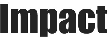
Impact
Impact used to have it’s place. Bold, blocky letters and defined lines. Unfortunately, this one has also run its course. Like the two previously mentioned, anyone can use this font at any time just by clicking the Fonts dropdown menu. So just don’t. Instead, go for something like Oswald.

Lobster / Permanent Marker
Lobster is a newer font and became a go-to for a different, vintage-y look. Permanent Marker is the same, only with the handwritten aesthetic. Both were stock fonts on built-your-own websites and do-it-yourself graphic design apps (hisssss), which made them popular… and then quickly overused.
I admittedly like both fien, but with dozens of alternatives, there’s no need to use two of the most popular Google fonts in original branding.

Papyrus
This one’s easy. This font has been around forever, so if you’re still using it to be “tribal, yet futuristic,” shame on you. And if you’re behind one of the biggest films of all time… shame on you most.
“He just got away with it… this man, this professional graphic designer. Was it laziness? Was it cruelty?”

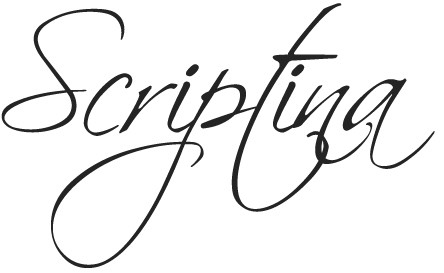
Scriptina
This one may not be as obvious, but I already see the trend. I started noticing it more and more upon realizing how often I would be drawn to it while designing (and occasionally use it). It’s also free, and increasing in popularity.
Look out for it and you’ll see it, especially in tattoos. That cute quote on your ribs is probably the same script as the inspirational saying on your bartender’s forearm. Not to judge, but if you want something permanent on your body to represent “you,” at least make it original — not something you pick out of the book at the parlour.
Same goes for branding: If you want something permanent to represent your company, don’t pick a font from a drop-down menu.

Comic Sans
Come on… what’s a list of bad fonts without Comic Sans? We’re all on the same page on this one, right Dan Gilbert?
You get what you pay for. So if you have an amateur, an intern, your nephew, or that kid in your office “who kind of knows his way around Adobe” design a logo or anything else, know that you may run into problems. And if a designer ever presents you with anything containing these fonts (especially Bleeding Dumbass Cowboys)… burn it Fahrenheit 451 style.

