Jackie Castro
|
Jackie Castro
|
A pop star on the rise.

When Colombian-American pop singer Jackie Castro first came to me, she had no solo music released. What she did have was a SoundCloud link with 10-12 demos of songs she’d been working on. I was hooked. And that SoundCloud playlist was on repeat in the office as we set to work creating the initial Jackie Castro brand. Luckily, when an artist has her voice, her look, and her work ethic, it’s a fun process.
“I’m obsessed with this branding; it’s so killer! Thank you for being a big part of getting this thing off the ground. Couldn’t be more excited!”
— Jackie Castro


Single Art
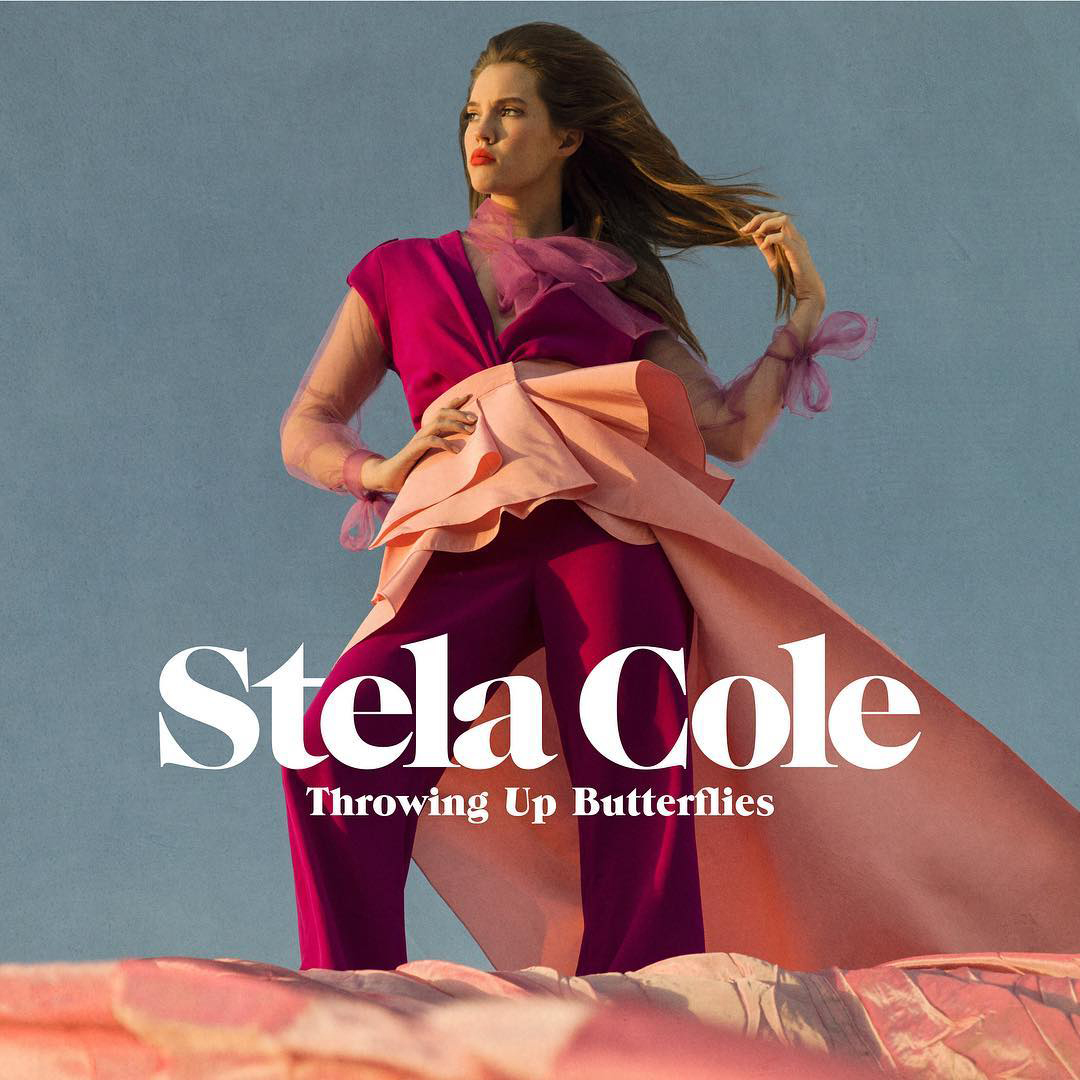
We mapped out a plan for three single releases with an analogous theme. After some collaboration, we found our keywords: The colors are bright and cute; the typography is classic and elegant. Just like Jackie.
Then Hourglass came along — a hauntingly-beautiful song about Jackie’s grandmother and her fight with Alzheimer’s. There wasn’t a dry eye in the office when it was first played. After Jackie shared some old pictures of her grandma, we knew we weren’t going back to pink and flowery for this one — we wanted hauntingly-beautiful. The result reminded us why we love our job.
Collateral
The goal of merchandise is three-fold: 1. to advertise to fans; 2. to catch the attention of people who aren’t fans (yet); 3. to make stuff that looks cool. Given that, we came up with three options: One that catches your eye; one that’s simple; and one that’s somewhere in between. And they all look cool!


HEX #F8DAE8
HEX #C82A30
HEX #FFFFFF

NAME / LOGO
TRACKING: 800
HEADING / TITLE
TRACKING: 600


